In your conversion funnel as an affiliate marketer or media buyer, the landing page will be one of the most important things in determining an ad campaign’s overall success. Make yours awesome with these tips.
After an end user clicks an advertisement on a website, the next page they arrive at is called a landing page. You can imagine that the landing page is thus very important. It’s the first real impression they get about the product they might end up purchasing or sign up up for… or not.
The end user has already taken a step in the right direction for generating a conversion for you. They clicked your ad, be it a banner or native ad, so if you did a good job of designing creatives they’re already interested.
This is a positive start to their journey through your perfectly crafted conversion funnel, but there are several crucial things to consider with your lander. In this blog post, we’ll touch on five important tips you should take to heart during the developmental process of your landing pages.
Tip #1: An organized page is important. Keep it short & sweet!
When the end user arrives at your landing page, they must be met with a clear and concise message about the service or product you’re trying to pitch to them. The delivery medium for your advertising message, at this point in your conversion funnel, is your landing page, so this web page of course cannot be a cluttered mess.
The information provided on the landing page must be comprehensive about the product or service you’re looking to have them sign up for, but it should also be to the point. Information that is not directly useful to the end user should generally be left out of an initial lander.
Tip #2: Use the natural eye flow of end users to your advantage.
When visitors arrive at your landing page, heat map tests have shown that there are essentially two common eye flow patterns people will have when viewing a web page:
- If the page is content-heavy (i.e. an article with a lot of words in it or a landing page with a lot of written content), the eyes will move in an F pattern. So they’ll view the top of the page from left to right, then move down the left side of the page vertically, and go from left to right again at a spot of interest (f.ex. if a sub-header catches the person’s attention).
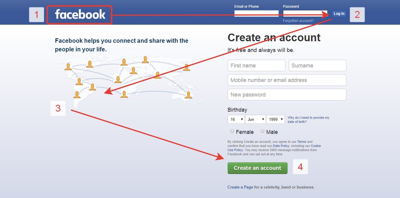
- The Z pattern is the general eye flow of end users on less content-heavy web pages. As most landing pages that are designed well will focus on the important things only, it’s safe to assume that the Z-pattern will be more relevant for most media buyers. Even Facebook uses a Z pattern on their landing page to get people to sign up, as you can see below.
Make sure to set up your landing page layout in a way that utilizes the common eye flow patterns. If you have a natural flow through the most important spots on the page, leading to the Call-to-Action (CTA) button, your landing page is set up for success.
If it’s difficult to distinguish where the important parts of your landing page are and they’re not along a Z pattern (when using a lander that isn’t very content-heavy and to the point), there is likely some room for improvement there. Test it out with some A/B testing to find out which landing pages perform best (preferably with all other variables being as close to equal as possible).
Tip #3: Answer all questions. Do not create new ones.
Know the audience you’re going after, figure out what their questions about your product or service are, and answer them on your landing page. The difference between a good affiliate marketer and a great one will be that a great one will answer all questions the end user has, but at the same time they will not raise new ones.
Tip #4: Use trust signals whenever possible.
The product or service you’re promoting has been utilized by or is somehow associated with some well-known brands? Then you should definitely make this known on your landing page to convey trust. Another trust signal can be known companies you’ve done business with or awards that have been won by you or your product / service. It’s important that you actively convince the visitor arriving at your landing page that your product or service can be trusted. They will have to give up some of their information to sign up, so trust is important to make this easier for them.
Tip #5: Have a great Call-to-Action (CTA) button.
Like some of the other tips listed here, this one is multifaceted and you should do a bit of experimenting that is well thought out. The button you use for your Call-to-Action should match the style of your landing page. You should be very mindful of your color choices throughout the landing page and then it’s up to you to decide how much your CTA button should stand out.
F.ex. if most of your lander’s layout is in various shades of blue with some black and white mixed in, then you may have chosen this color because it conveys trust. Banks often use blue as a color of choice because of this. A slight contrast may already be achieved by using green, which also happens to be the color that represents growth and money.
A more aggressive color choice to really place the end user’s focus onto the CTA button would be red, as it’s a large contrast to an overall blue layout. A poor color choice would likely be blue on a largely blue layout… or gray, which tends to just blend in without being noticed.
Beyond the color of the Call-to-Action button, it’s also important to keep the wording brief, to the point, and preferably use what are known as low friction words. Instead of asking the end user to give or invest something (f.ex. with a Submit or Buy Now button text), you should aim to word it so the potential user is gaining or getting something. Try using words like discover or get for your CTA button text. Personalize it to your audience for bonus points!
Also good to know about CTA buttons: It’s not the more the merrier with them. If you guide your visitors to the one CTA button you’ve placed on the page in a strategic position, this will often be much more effective than placing several Call-to-Action buttons on the landing page. In fact, placing too many could make you look desperate for leads or sign ups, which isn’t a great position to put yourself in.
Have a clear choice that the end user viewing your lander should make and allow them to make this decision by clicking your one, well-designed CTA button. Don’t fatigue them and get them off track with multiple buttons to potentially click. Most likely you will diminish your conversion rates this way.
Thank you for reading!
Obviously, we don’t have a crystal ball that tells us the fortune of every media buyer and affiliate marketer on the planet, but the above tips are intended to give rough guidance on how to construct a successful landing page.
Our tips are based on online marketing research we’ve conducted ourselves with the help of our in-house media buyers, as well as external advertising experts we’re in constant contact with.
We hope this post is helpful on your path to becoming one of the best at online marketing. If you happen to just be starting out on this journey, we invite you to read our guides, especially our freshly added Beginner’s Guide for Advertisers.
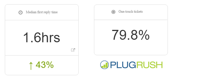
Thanks for reading and hit up our excellent support team, if you have some questions that are left unanswered by this post and our guides. On average, we respond to support tickets in less than two hours and will resolve your issue in a single response most of the time (almost 80%).